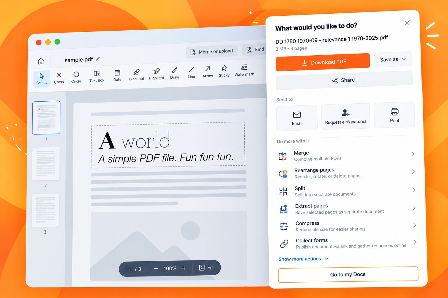
The post-edit "What would you like to do?" modal is the highest-traffic decision point in the editor. Seventeen equally weighted tiles meant the options worth finding were the hardest to see. I rebuilt it as a hierarchy — one primary Download CTA, a Save As dropdown, sections named for intent, and a new tools row — so every action had somewhere to be found. Every single one then converted better than before, and two surfaces that hadn't existed at all converted at two to three times the surface average.
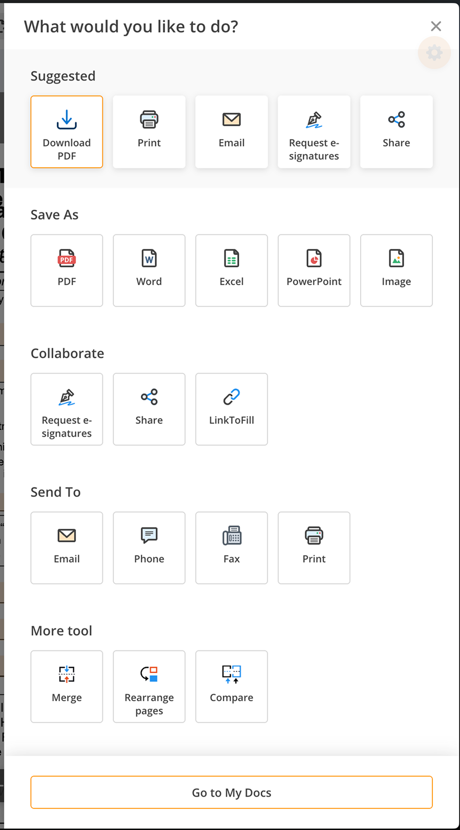
The product's busiest decision point was a flat grid of seventeen equal tiles. Attention went to the cheapest actions; the best-converting ones sat at the bottom.
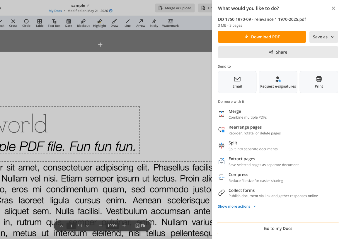
One primary CTA, then intent. Download first, formats and cloud behind a dropdown, sections named for goals instead of file types, and a new tools row.
Every action converted better — the biggest movers gained roughly a quarter. Two brand-new surfaces converted at 2–3× the surface average.
The population average moved the other way — because one action's share of clicks nearly tripled and it was the only one that stayed flat. Mix, not mechanics.
The product is a browser-based PDF editor. When a user finishes editing a document, a modal appears asking "What would you like to do?" — download it, email it, send it for signature, print it, save it somewhere. Hundreds of thousands of new desktop users see it every two weeks. It is, by traffic, the single most consequential decision point in the product.
It is also where most first-time users meet the paywall. Roughly half of new-user revenue is attributable to sessions that touch this dialog. That makes it a monetisation surface as much as a navigation one — and it had grown by accretion. Every new feature over several years had earned itself a tile, and nothing had ever been taken away.
Everything on this screen has the same size, the same border and the same visual weight — so nothing on it tells you which action is worth taking.
I started with two experiments' worth of event data and ranked every action twice: once by how often people clicked it, once by how well those clicks converted. The two lists came out almost exactly inverted.
Rank order only — click shares, conversion rates and revenue per action are withheld. Passive exits (Go to My Docs, closing the modal) are excluded; they dominate by volume but signal no intent.
The single best-converting action in the product sat dead last by clicks. Email, the second best, sat mid-table. Meanwhile the Word / Excel / PowerPoint cluster took a large share of clicks and returned almost nothing — a near-total drop-off between clicking a format and paying for it, which pointed at a paywall or pipeline problem, not a demand one.
That is a layout problem, not a demand problem. Seventeen tiles at identical visual weight let default scanning behaviour decide the outcome, and default scanning behaviour rewards whatever is nearest and most familiar.
Seventeen tiles at equal visual weight, in five sections named after file types and mechanisms.
One primary Download CTA, then sections named after intent.
Email, Print, Share and Request e-signatures each appeared twice, in different sections.
Each action appears once. No duplicate is doing work the original isn't.
Labels written from the inside out: "My Docs", "Collect forms", "LinkToFill", "Phone".
Labels written from the user's goal: "Send via SMS", sections a first-timer can parse.
No route to mid-funnel tools (merge, split, compress) and no cloud destinations at all.
A tools row that opens each tool with the document pre-loaded, plus Drive / Dropbox / OneDrive / Box.
When the most-clicked list and the best-converting list are near-perfect inversions of each other, the interface — not the audience — is choosing.
Before proposing anything, I audited the equivalent moment in SmallPDF, iLovePDF, PDFCandy, Sejda, Canva, Google Docs and Google Slides. The convergence was striking: none of them present a flat grid, and all of them make the same five moves.
Every product tested gives download a single dominant button and hides the format list behind it. Format is a refinement of a decision already made, not a decision of its own.
"Save to Drive / Dropbox" lives beside the download, not in a separate integrations menu. It reads as another place to put the file, which is exactly what it is.
Merge, split, compress presented as next-best actions rather than a separate product area. This is where competitors harvest engagement after the export decision.
"Suggested / Share / Send" beats "Save As / Collaborate / Send To / More tool". Users arrive with a goal, not a file-format preference.
Every product hides PowerPoint, HTML and the long tail. Access is preserved; visual competition with the primary path is not.
Our modal treated all seventeen actions as peers. That single difference accounted for most of the experience gap against the category.
When seven independent teams converge on the same structure, the burden of proof sits with the outlier — and we were the outlier.
This surface generates enough revenue that "it looks cleaner" is not an argument anyone should accept. So every change went into the spec paired with the principle it rests on and the behaviour it was meant to change. That pairing is what got the redesign through review.
Decision time grows with the number of options; a visually isolated element is chosen more often; a bigger target is hit faster. Download was already the dominant intent — promoting it converts hesitation into action rather than creating new demand.
Users who need a specific format are motivated enough to look for it. Users who don't shouldn't have to process it. Nothing is removed — only deferred until asked for.
Nobody "hires" Email or E-sign as products. They hire get this document to where it needs to go. A shared boundary communicates that shared purpose before a single label is read.
Attention decays down the page, and working memory tops out around seven items. Seventeen peers exceed it; five named chunks don't. The first thing seen also sets what the product appears to be for.
These actions took a rounding error of clicks while occupying the same real estate as the best converters. A power user looking for fax will recognise it on expansion; a first-timer is never distracted by it.
Losses motivate more than equivalent gains — naming the document as the thing at stake is stronger than an opaque "Sign up". It also closed a route that let signed-out users reach the dashboard and bypass the paywall entirely.
The shipped panel, rebuilt to spec. Hover or tab to a numbered pin to see the decision behind that part of it.
Two things I proposed did not ship, and I think both calls were right. An AI section (summarise / translate / ask) was cut from this test and split into its own variant, so a latency-and-cost bet wouldn't contaminate a layout result. And renaming "Collect forms" to "Publish as form" was dropped — the team wanted the naming decision made across the whole product, not inside one modal.
Nothing was removed from the product. Every action in the original modal is still reachable. What changed is what the user encounters first, how much they have to hold in their head to get there — and that the whole thing moved out of a centred modal into a side panel, so the document stays on screen while you decide what to do with it.
One Download CTA carrying the primary intent, "Save as" beside it, Share underneath, then sections named for what the user is trying to do — "Send to", "Do more with it". Every tool carries a one-line description of what it actually does.
It also stopped being a modal. The centred dialog became a side panel, with the document still visible beside it — the user can see what they're deciding about.
Signed-out users see the same panel, with one difference: this footer reads "Go to my Docs" for people who already have somewhere to return to, and "Create account and save" for people who don't. That version is visible in Fig. 03.
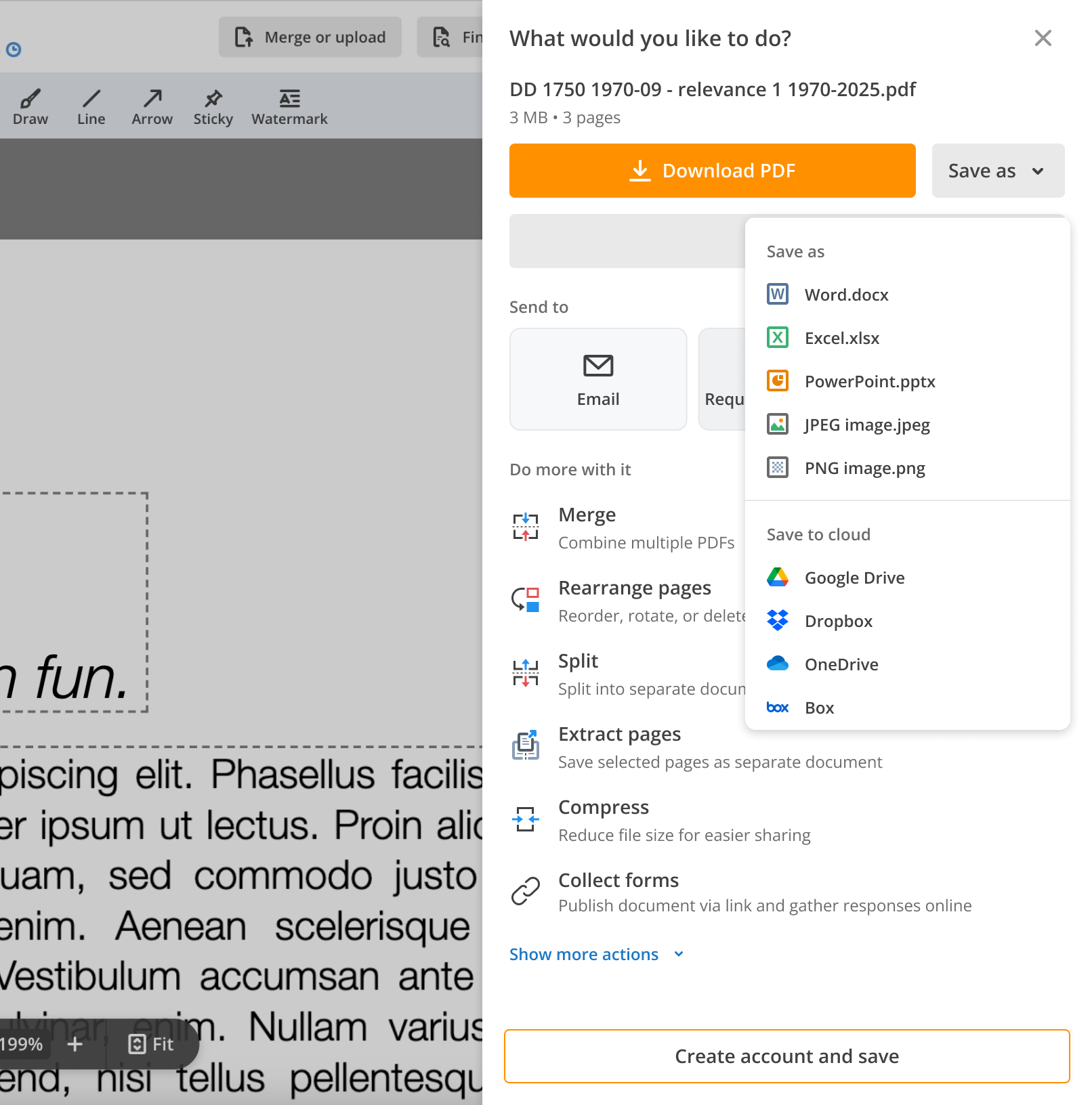
Formats and cloud destinations in one compact list — icon, name, extension — split under two headings: Save as for file types, Save to cloud for Drive, Dropbox, OneDrive and Box. Rare formats stay one click away instead of competing for the first glance. Fillable-field preservation became the default on the primary download.
This shot is the signed-out variant, so it also shows the footer a first-time user gets: "Create account and save".
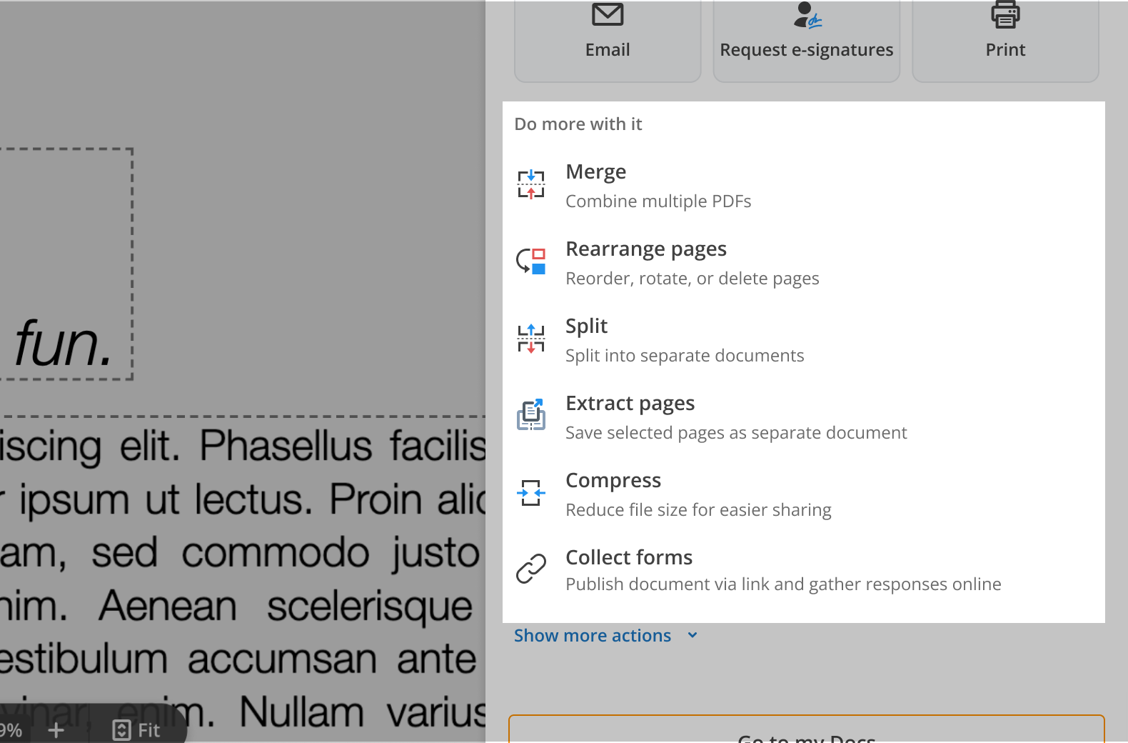
Merge, rearrange, split, extract, compress — plus Collect forms, which finally got a sentence explaining what it does. Each opens the relevant tool with the current document already loaded, so the next action costs one click instead of a re-upload.
Shipped UI, captured on a sample document — no customer file or account data shown.
The redesign went out as a controlled experiment against the existing modal, with the AI-heavy variant held as a third branch so that layout and AI wouldn't be confounded. Two primary metrics were agreed before launch: the share of viewers who give card details in-session, and the share who complete an export.
Sample size withheld. Secondary metrics tracked per-action click rate, dropdown engagement, cloud-save adoption and tools engagement.
At the population level, both primary metrics moved the wrong way — one of them comfortably significant. Read only that far and the redesign looks like a loss.
Read one level down and it isn't. Here is the same experiment, both ways.
Bars scaled to relative % change · zero line marked · absolute rates withheld
Fax and SMS also posted double-digit gains on very low volume — real, but too noisy to lead with. Collect forms was the one action that slipped, also on low volume. Export and payment-intent deltas move in the same direction as the conversion deltas shown here.
So: every action a user could take converted better than it did before — the two biggest movers by roughly a quarter — and two surfaces that hadn't existed at all started producing conversions on their own.
Because the redesign worked — hardest of all on the action it made most prominent. Download PDF's share of Choice viewers nearly tripled. It became the largest cohort in the experiment by a wide margin — and it was the only action whose conversion stayed effectively flat, with a real drop in registrations.
A cohort that large, merely flat, is enough to pull the population average negative while every other cohort is winning. The mix changed, so the average changed — even though no individual experience got worse. This is a composition effect, not a broken funnel.
The mechanism is straightforward once you see it. Download PDF is now the first, most prominent thing in the panel — the path of least resistance. So it absorbs a large volume of low-intent, exploratory clicks from people who previously drifted out of the dialog without clicking anything, or who had to scroll to find the thing they actually wanted. Those clicks are real, they are just not intent. Averaged into a cohort, they dilute it.
The redesign did exactly what it was built to do: it made actions findable. The one it made most findable happened to be the weakest converter of the set — so the win shows up in every cohort and hides in the average.