← All work
Case Study 01 / 2025–2026 · Landing-page platform · Follow-up Automation

Doubling email activations by removing friction from follow-up automation.

Users of a landing-page builder for marketing teams (Instapage) rarely set up follow-up emails — not by choice. The flow stranded them in an empty dropdown inside the form builder, sent them off to a separate email tool to create one from scratch, required them to manually flip on the "automated" status, and made them navigate back. I rebuilt it as a connected cross-product workflow: a clear entry point from the form, a new tab that opens directly in email creation, and templates that ship with automation already on. Activations doubled in the first weeks after launch.

RoleLead Product Designer
Owned end-to-end design
ProductLanding-page builder
for marketers (Instapage)
TeamPM, 3 engineers,
analytics, support
DurationNov 2025 — Jan 2026
~3 months
Outcome2× activated
automated emails
Note

Published with written permission from airSlate (May 2026). Customer screenshots, employee names, and any personally identifying information have been omitted under the terms of the permission.

01 · At a glance

The headline numbers.

Pre-launch baseline (21 Oct – 6 Nov 2025, two-week window): 10 accounts activated follow-up automation — 0.11% of total users, and only 2.4% of users who saved a form. After launch, that rate doubled.

Activation lift of accounts activating follow-up automation vs. pre-launch baseline
Friction points removed 4 → 0 dead-end dropdown, cross-tool navigation, hidden automation toggle, manual return path — all gone
Target vs. actual 2× / 3× PRD target was 3× lift — honest read: close but short, a useful calibration
Shipped Jan 2026 connected cross-product workflow with pre-automated email templates for Instapage Email
02 · Context

Why this mattered to the business.

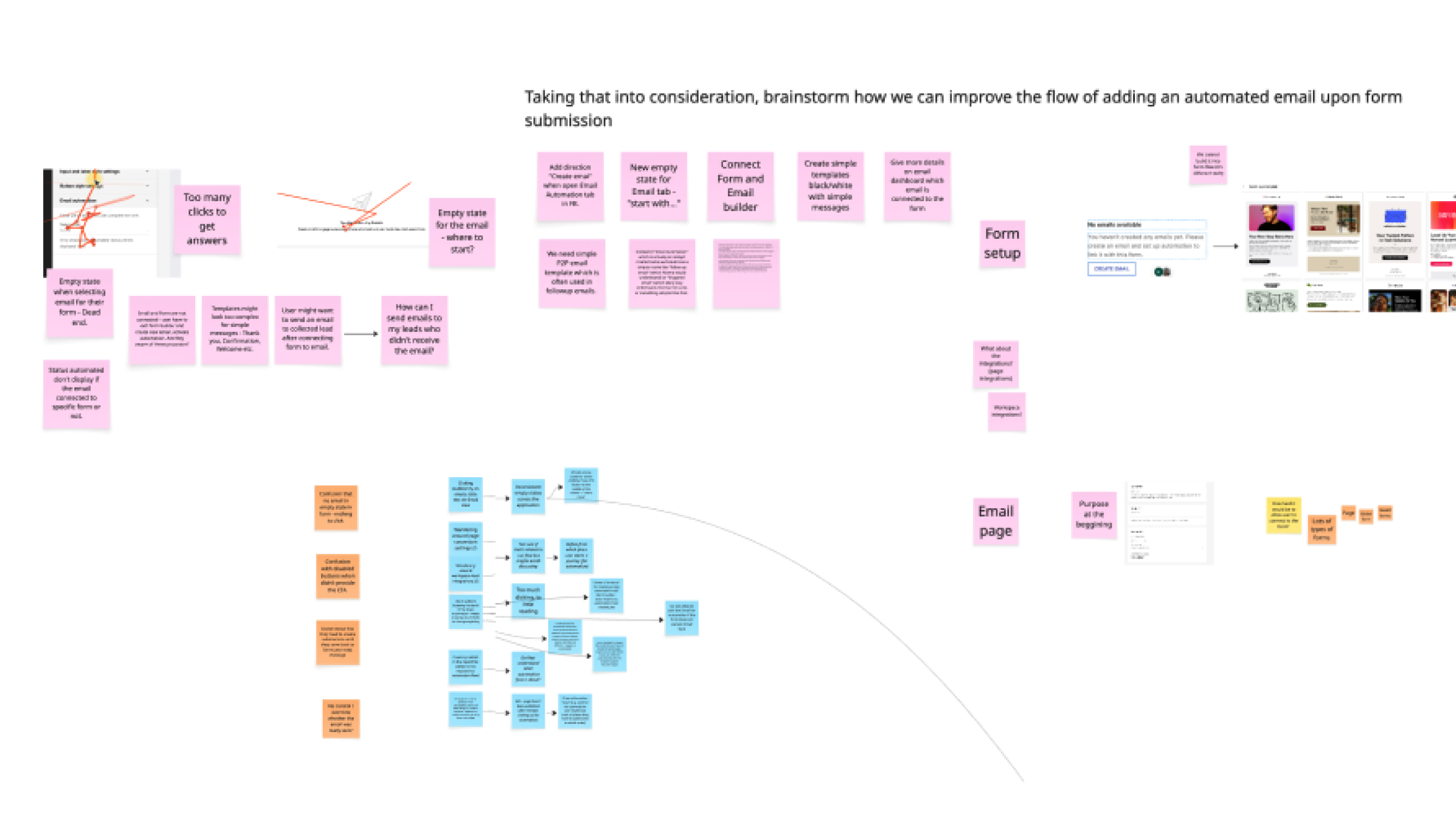
The product is a landing-page builder used by marketers to launch campaigns quickly. The built-in email module lets a published landing page automatically email leads the moment they submit a form — the natural next step in any campaign. Together, they form the four-step pattern customers buy the product for:

Four-step marketing pattern: create form, add it to a landing page, collect leads via form submission, engage leads via automated follow-up email — with step 4 highlighted as the focus of this case study
Fig. 00 The pattern customers want to run. Steps 1–3 worked. Step 4 — the follow-up email — almost never got activated.

On paper, every landing page should have a follow-up email. In reality, almost none did. The product existed, customers paid for it, and the feature sat idle. It was a textbook activation problem: a strategically important feature with near-zero adoption.

03 · The problem

Low adoption wasn't a strategic choice — it was a blind spot.

I dug into the funnel with our analytics and support teams, and into Hotjar session recordings for qualitative signal. Three things lined up:

Team brainstorm artefact mapping the friction points: where users dropped off, what Hotjar showed, what support tickets corroborated
Fig. 02a Mapping the friction with the team — Hotjar sessions, support tickets, and funnel data converging on the same diagnosis.

Support tickets corroborated: seven separate tickets in the same two-week window asking how to set up a form submission follow-up. A feature that was advertised as simple was complicated enough that customers were asking humans for help.

The funnel, in numbers

StepUnique usersConversion vs. prior step
Any product event (total active users)6,305
Form added to a landing page1221.9% of total users
Form saved to library4246.7% of total users
Email automation activated10≈ 8.2% of those who added a form to a page · 2.4% of savers · 0.11% of total

Usage window: 21 Oct – 6 Nov 2025. Source: internal analytics + Hotjar qualitative review.

04 · The old flow

Eleven actions, four friction points, and a lot of leaving and coming back.

I mapped the existing flow end-to-end. Users started in the form builder, hit an empty "Select email" dropdown with no path forward, navigated away to a separate email tool, created an email from scratch, manually flipped the "automated" status, activated, and then re-found their way back to the form they'd left. Four of those steps were friction points where users actively dropped out.

Diagram of the old 11-action follow-up automation flow with four friction points: empty dropdown dead-end, context switch to email tool, hidden automation toggle, and long manual return path
Fig. 01 The old flow, as mapped from product analytics and Hotjar recordings. Red overlays mark where users dropped off or backtracked.

The friction wasn't any single step — it was the cognitive cost of switching contexts. A marketer building a campaign was being asked to become an email author, then a workflow configurator, then a form editor again, in one sitting. Most stopped partway and never came back.

The old experience, up close

Fig. 02 The old form editor in motion. Email automation exists as a dropdown that expects a pre-built email. If you don't have one, the interface gives you no way forward from here.
05 · Hypothesis & targets

Before we designed anything, we wrote down what we thought would happen.

If we make follow-up automation visible, guided, and auto-enabled right after a form is created or added to a page, we will increase users sending automated emails by 3×.

The numeric targets we wrote in the PRD

The assumption we pressed the team on: our existing email product was good enough for at least 5% of users who already created and saved forms.

06 · Design decisions

Four problems, four decisions.

The team had an instinct to "redesign the email builder." I pushed back. The email builder wasn't the problem; the bridge between form and email was. Rebuilding the email tool would have consumed the roadmap and wouldn't have moved the metric we cared about. I broke the user journey into four specific friction points and designed one decision against each.

# Problem Solution
01 Dead-end empty state. Users opened the email automation section inside the form builder and saw an empty "Select email" dropdown — no CTA, no guidance, no path forward. A clear entry point inside the form settings panel. The CTA lives exactly where users already were, at the exact moment they'd just built a form — no more dead-end dropdown.
02 Cross-tool context switch. Users had to manually leave the form builder and navigate to the separate email section to create an email from scratch. A new tab into the email creation flow, with the form tab preserved. Clicking "Create Email" opens a new tab directly in the email tool — the form context stays open in the background. Users come back with one tab click, not a re-navigation.
03 Hidden requirement. Users had to manually enable the "automated" status on the email and then activate it. Only automated emails could connect to forms — but the requirement was invisible. Pre-automated email templates. When a user picks a template, the email is already wired up with automation enabled. They fill in the necessary fields and activate. The orchestration happens on our side.
04 Manual return path. After building and activating the email, users had to navigate manually back to the form builder to connect it — "where was that form again?" The form tab stays open the entire time. One tab click brings users back — no re-navigation, no re-finding. The dropdown that was empty before is now populated with the new email, ready to connect.

The key trade-off

The biggest call: whether to treat follow-up email as a property of a form or as a first-class object with its own lifecycle. I argued for the first — at this stage of the product's maturity, the email doesn't need to exist without a form attached. Keeping the object model simple let us ship in weeks, not quarters, and we can split them apart later if the data supports it.

Old vs new flow, side by side

The new flow has eight actions, the old had eleven — a small numeric reduction. The real change is what was eliminated: the empty dropdown that stranded users, the cross-tool navigation that broke the form context, the hidden "automated" toggle users had to remember, and the manual journey back to re-find the form. Each of those was a place where users dropped out.

Side-by-side comparison of the old 11-step flow with friction markers and the new 8-step flow without them
Fig. 04 The two flows aligned. Same starting and ending action; four friction points removed in between.
07 · The shipped solution

Connected across tabs, with automation already on.

The form settings panel now shows follow-up automation as an explicit, visible option, with a Create Email CTA where the dead-end dropdown used to be. Clicking the CTA opens a new tab directly in the email creation flow — the form tab stays open in the background. Users pick a template first, build the email, and activate. The key move: every template ships with automation pre-enabled. Users don't need to know that "Enable automation" is a required step, hunt for the toggle, or remember to flip it. When they come back to the form tab, the dropdown that was empty is now populated with the new email, ready to connect.

Fig. 03 The new flow in motion. The form tab stays open while a new tab handles email creation — the dropdown populates automatically on return.
Fig. 03a The new form settings panel in close-up. The CTA is explicit, the state is clear, and the next action is one click away.
08 · Outcome

Activations doubled. We missed the 3× target — and that's a useful finding.

In the weeks after launch, automated email activations approximately doubled against the pre-launch baseline. Support tickets related to follow-up email setup stopped arriving in the volume we'd seen before.

Result summary: 2× activations, 0.11% to ~0.22% of total users, ~4.7% of form-savers — within striking distance of the 5% hypothesis ceiling
Fig. 05 The result, in one card. The four friction points eliminated; activations doubled; saver-conversion landed within striking distance of the 5% hypothesis ceiling.

We had targeted a 3× lift. We got ~2×. I don't spin this as a win-win. Here's what I actually took from it:

  • The UX change was necessary but not sufficient. We removed friction — and the remaining gap suggests the email builder itself (the thing we decided not to redesign in this cycle) is now the next real constraint.
  • Our hypothesis model over-indexed on friction. We assumed friction explained most of the gap. In reality, it explained about half. The other half is likely awareness at a different point in the journey.
  • "5% of savers" was probably the wrong benchmark. Not because users don't want follow-up email — but because of who reaches form-saved state. A non-trivial portion are exploring, not launching.
09 · What I'd do differently

Reflections.

I'd instrument the "email was added to a form" event before shipping. We were missing it, and had to reconstruct the metric after launch. Small oversight, real cost in measurement confidence.

I'd run a pre-launch usability test with users who'd already churned on the old flow. I leaned on Hotjar and support tickets for the diagnosis. They were enough — but five 30-minute interviews with actual former dropouts would have tightened the hypothesis and surfaced the awareness-at-other-points problem earlier.

I'd set a two-phase target. Writing "3× lift" as a single number assumed one intervention would close the gap. A two-phase plan — UX friction first, then email builder maturity — would have let us celebrate the 2× as the win it was, while framing the next cycle cleanly.

More work