Instapage had hundreds of templates, but most users still started from a blank page because the template library was difficult to navigate and overwhelming to browse. I led the redesign of the template selection experience end-to-end, focusing on improving discoverability and reducing decision friction. After launch, the average template selection time decreased from 10–15 minutes to 3–5 minutes.
~10% of created pages started from a template; ~90% came from a blank canvas. The catalog existed but didn't function as a starting point.
No way to filter or narrow the catalog. Users scanned a flat grid of generic thumbnails, gave up, and started from blank — the slowest possible path.
A five-axis filter taxonomy (Industry, Use Case, Page Type, Color, Style) with explicit OR/AND query logic, applied tags, and a curated set of new layouts.
Search, sorting, and live template count were postponed to future iterations — partly technical (infrastructure wasn't ready), partly to force focus on filter quality first. A good taxonomy beats a search bar over a bad catalog.
Time spent selecting a template fell from 10–15 min to 3–5 min (sampled from 10 random session recordings, post-launch). Template-led creation moved from long tail to default path.
Lead Product Designer, end-to-end: research, IA, filter logic, flows, high-fidelity, marketing-site sync, admin tooling for the curation team.
This project was part of a broader company initiative focused on improving the trial experience and making templates a more central part of the product journey.
I owned Phase 1 end-to-end: redesigning the in-app template catalog and aligning it with the marketing website experience, so users would see the same templates before and after signup.
The challenge was that template adoption was extremely low. Even though Instapage had hundreds of templates available, most users ignored them and started from a blank page instead. Only around 1 in 10 pages was created from a template.
Before expanding the template ecosystem further, we first needed to solve the core UX problem: users struggled to discover, compare, and confidently choose templates inside the product.
Phase 1 wasn't about volume. It was about turning templates from a feature buried in the editor into the system the rest of the funnel could rely on.
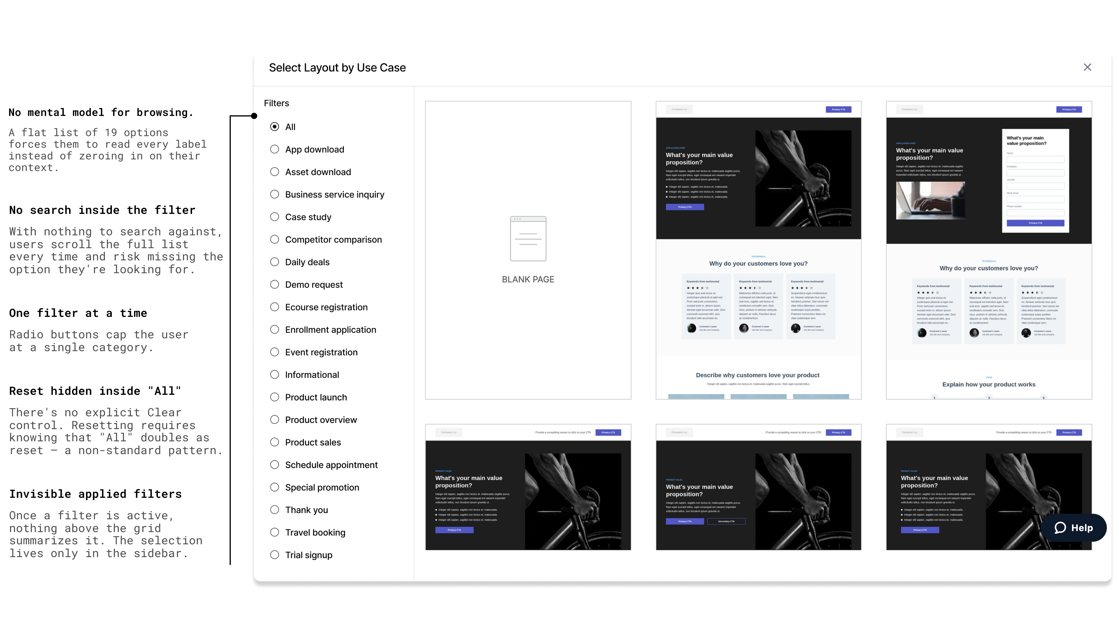
I started by treating the existing catalog like an unknown product and walked through the new-user flow myself. The story was the same every time: land on the layouts page, see ~80 thumbnails arranged with no apparent logic, scroll, scroll again, fail to spot anything that fits, click "blank page" instead. There was nothing wrong with the templates individually — the system around them gave the user no purchase.
Three structural issues compounded:
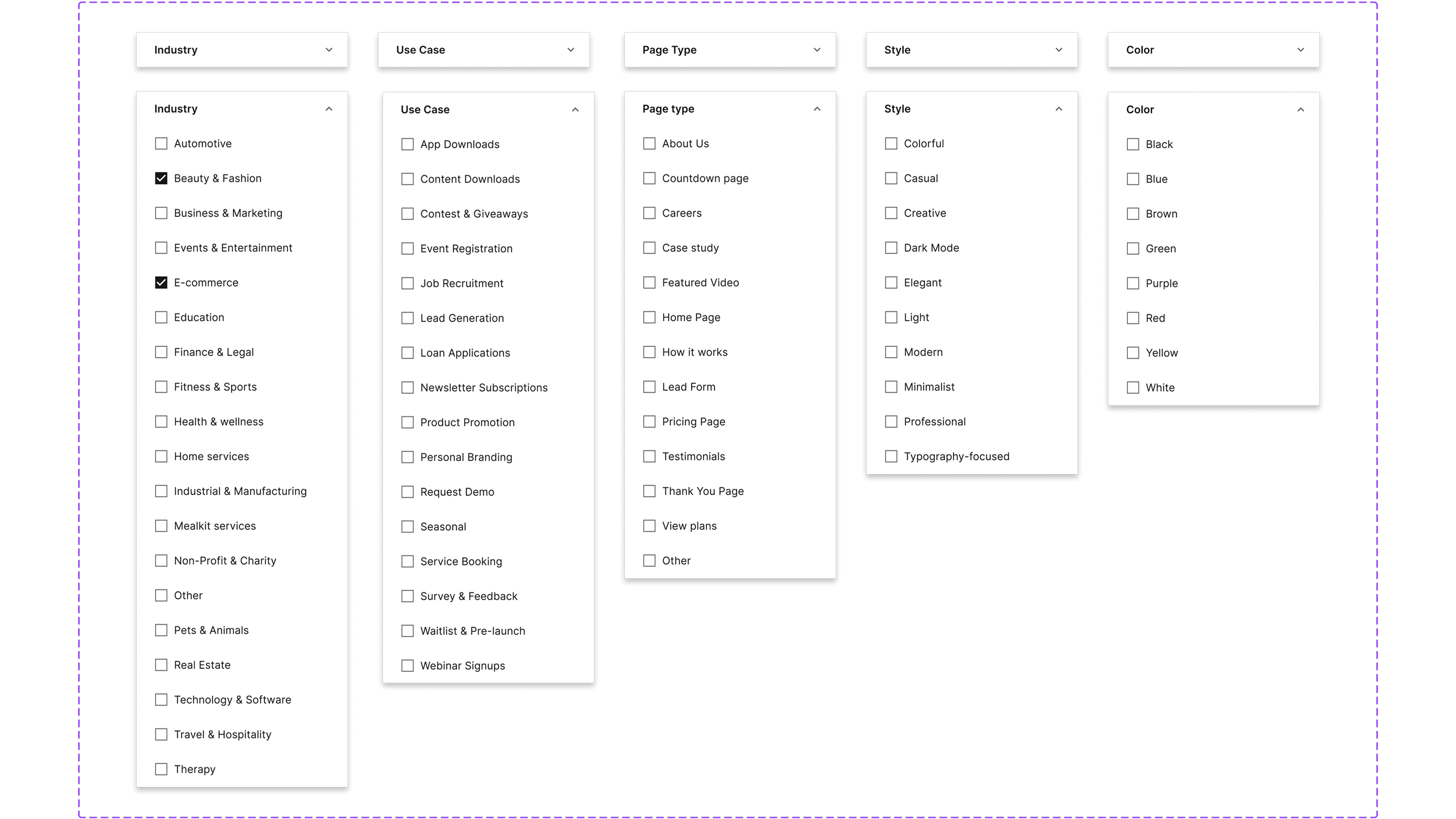
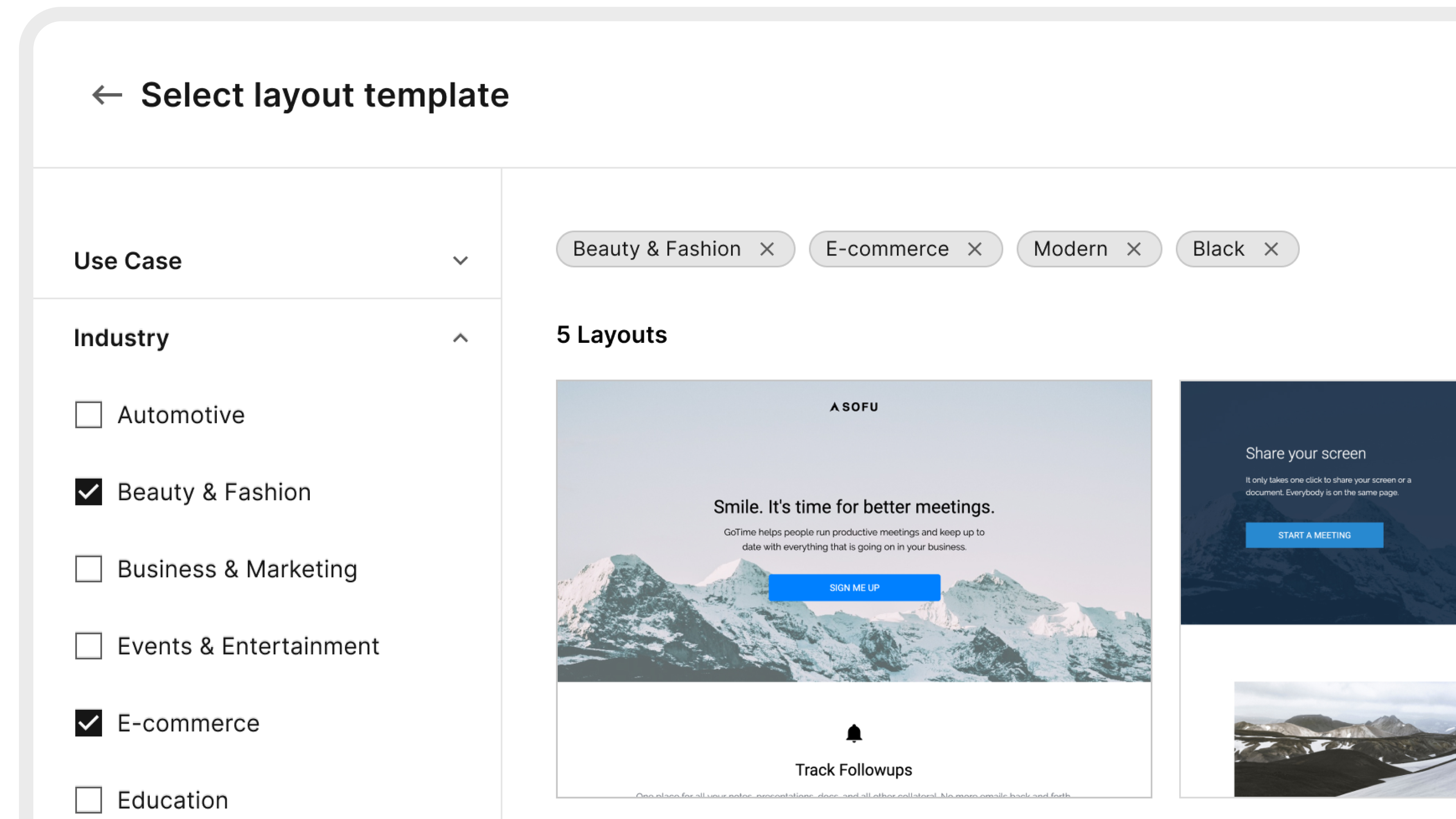
The blank-canvas escape hatch was the predictable consequence — and the slowest possible path for a new user. An empty page editor is the worst onboarding in landing-page software: every decision has to be made from scratch, in a tool the user is still learning.
Users weren't choosing blank canvas because they preferred it — they were choosing it because it was the only path they could navigate. The library wasn't broken. It was unindexed.
We intentionally started with the filtering structure before redesigning the catalog UI. Instead of focusing on thumbnails or visual polish first, we focused on how templates were organized and discovered. The goal was to make the existing library feel easier to navigate and more relevant — without simply adding more templates.
Together with the PM and engineering lead, I helped define a clearer filtering system with five filter categories that users could combine naturally while browsing:
Two simple rules made the system work — and I asked the team to write them down explicitly, because filter behavior is where good catalogs quietly fail:
If a user picks more than one Industry, show templates that match any of them. (Showing only templates tagged with both would usually return nothing.)
Combine filters from different categories to narrow the results — show only templates that match both.
In parallel with the filter taxonomy, I collaborated with our Professional Services team to refresh the template library itself — the team that helps customers with custom solutions, page design, onboarding, and implementation, so they know what real customers actually use templates for. The catalog had accumulated over years; many templates were aged and visually similar to each other. Together we curated the existing set down, then added a new layer of visually distinct templates with stronger differentiation across use cases. A good filtering system on top of a stale catalog would only solve half the problem.
Three things stayed out of scope for Phase 1: search functionality, sorting, and a live template count. The constraints were partly real — the search infrastructure wasn't ready and the live-count required event tracking we hadn't built — and partly by design choice. I wanted the taxonomy to carry the catalog on its own before we earned the right to layer search on top. If users were finding the right template through a search bar, we'd never know whether the filters worked.
Postponing search was partly forced, partly chosen. Either way, it was the right call: the filtering system had to carry the catalog on its own before search could be added on top.
Filtering happens upfront — users narrow the catalog before opening any individual template, so every preview is a deliberate commit rather than a guess. The flow works the same way for new and existing users.
The old flow had two doors: "use a template" (hard) or "blank page" (easy). The new one has one door, with templates on the other side of it. The blank canvas still exists, but it's no longer the path of least resistance.
The PRD framed three nested hypotheses, each with a metric we could read post-launch.
Phase 1 owned the first hypothesis. The numbers below show the documented baseline ratio (template:blank = ~0.1, i.e. 10:90) and the post-launch target:
The interesting design conversations on a project like this are rarely about the visible UI. They're about the constraints — what gets cut, what gets simplified, what gets refused. Four of those calls shaped Phase 1.
One trade-off we accepted: with 294 templates total — small compared to some competitors — combining several filters at once could leave a user in an empty state with no results. We planned to grow the catalog in future iterations precisely so the filtering system could keep narrowing without running out of templates. The taxonomy was built first; the volume to fill it was a known follow-up.
Phase 1 was about doing fewer things, on purpose. A focused catalog with deliberate constraints is a stronger foundation for Phases 2 and 3 than a feature-rich one no one understands.
Four pieces of the design are worth seeing — the catalog grid with the new ordering and filter interaction, the filter panel with all five axes, applied tags, and the template preview state.
To validate the quantitative results, I also reviewed 10 random Hotjar session recordings after launch and manually measured the time between users landing on the template page and opening a template in the editor.
Two other things moved with the time reduction:
The percentage of pages created from templates increased by approximately 3–4× versus the pre-launch baseline.
Users moved through the new-page onboarding funnel faster — fewer drop-offs at the template-selection step, more deliberate first edits.
Template selection time fell from 10–15 minutes to 3–5 minutes; template-led page creation moved from ~10% to ~35% of total. The library stopped being a feature buried in the editor and started being the front door of the product — the position the rest of the funnel was waiting for it to occupy.
Three things I'd change next time.
The work that determines whether a catalog feels good is invisible — it's the taxonomy, the ordering rules, the curation tooling. Visible UI is the last 10% of a project like this, even though it's the part that gets reviewed.